Five Fascinating Font Facts From Simon Garfield’s New Book, Just My Type
Monday, September 12, 2011
How big a type geek am I? Enough to have annoyed plenty of less-interested friends and relatives with unwanted discussions of typeface minutiae, but not enough to have ever tried seriously designing it. In other words, the ideal audience for Simon Garfield’s new book Just My Type.
Less a comprehensive introduction to type theory and more a collection of type lore – think Font Appreciation, not Typography 101 – this engaging, witty little volume re-awakened my own fascination with the subject by telling the historic, cultural, artistic, and psychological stories behind the letterforms all around us. Here are five things I learned during my all-too-short journey through Just My Type.
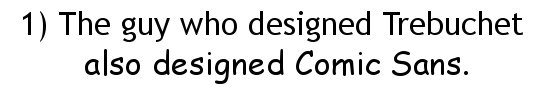
Yes, the impeccably credible Trebuchet and the much-mocked Comic Sans were both designed by Microsoft typographic engineer Vincent Connare. Connare seems to have a sense of humor about being known as “the Comic Sans guy”, but insists that his most notorious creation has its uses, if not necessarily on ambulances and tombstones. “If you love Comic Sans, you don’t know much about typography,” he tells Garfield. “If you hate it, you really don’t know much about typography, either, and you should get another hobby.” But what does it mean if we love Trebuchet?…
2) Other languages have their own “quick brown fox”. Even if you don’t know that a pangram is a sentence with every letter of the alphabet, you’ve no doubt heard “The quick brown fox jumps over the lazy dog.” English-language typographers aren’t the only ones who use pangrams to show off their typefaces, and the choices mentioned in Just My Type can say something about the culture. The libertine French say “Portez ce vieux whisky au juge blond qui fume” (“Bring this old whisky to the blond judge who smokes”) while the wacky yet intellectual Dutch say “Zweedse ex-VIP, behoorlik gek op quantum-fysica” (“Swedish ex-VIP, pretty crazy about quantum physics”). But the Germans are all business in Hermann Zapf’s pangrammatic aphorism: “Typographie ist zweidimensionale Architektur und bedingt extra Qualität in jeder vollkommenen Ausfuehrung” (“Typography is known for two-dimensional architecture and requires extra zeal within every job”). Yeah, good luck getting some cute animals to act that one out.
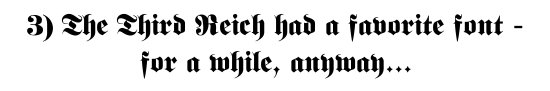
The original “font Nazis” were the actual Nazis. The most thorough totalitarians in world history didn’t overlook typography, either. See that armor-plated Germanic script up there, the kind of type that seems to be sneering at you from behind a monocle? The Nazis insisted that it was the only typeface suitable for pureblooded Aryans to read. Until, at least, a couple of years into World War II, when the cost of producing that heavy, resource-intensive type got too high to justify. Presto: the Nazis decided that the previously mandatory Germanic script had actually been Jewish all along.
4) Eric Gill, one of the greatest fontographers of all time and the creator of Gill Sans, was a total freak. No font better exemplifies the stoic, civilized stiff-upper-lip attitude of 20th century England than Gill Sans – there could have been no better choice for the famous KEEP CALM AND CARRY ON poster. Meanwhile, its creator, Eric Gill, was carrying on “experiments” in incest and bestiality, meticulously recording it all in his diaries. This was all (icky) news to me, but well-known enough in the design community that Garfield cites a Typophile discussion about the ethics of using fonts created by scumbags.
![]()
5) The day of the font auteur is probably over. Speaking of Gill and his ilk, the pages of this book – and the history of typography – are filled with tales of heroic creators and their enduring, iconic typefaces, from Claude Garamond scraping away in the back alleys of 16th-century Paris to Tobias Frere-Jones’s typeface Gotham carrying Barack Obama to the White House. But not only is the great-man theory of typography usually heavily mythologized – just about every one of these big names also had a staff working for him, and built on the type innovations of the past – it also might be coming to an end.
The rise of ClearviewHwy on the highway signs of the United States points the way (sorry) to a different approach for the dominant typefaces of tomorrow. Instead of some lone visionary reshaping the built environment through sheer alphabetical brilliance, ClearviewHwy was engineered through painstaking tests by a research & design team bearing an alphabet soup of postgraduate degrees. Design by committee worked in this case: ClearviewHwy is both more readable and friendlier than the familiar Highway Gothic.
There’s plenty more of this sort of thing in the pages of Just My Type, from the domination of Swiss fonts, to what makes a font “punk”, to Garfield’s own nominations for the worst fonts in the world. If you’re looking for a textbook on typography, this isn’t it. But Just My Type just might inspire you to download a font-editing program and try your hand at the art of letters.
Comments
Comments are closed.